 |
|
|||||||
| Locker Room Main Forum Commanders Football & NFL discussion |
 |
|
|
Thread Tools | Display Modes |
|
|
#1 |
|
The Bringer of Digital Bling
Join Date: Apr 2004
Location: Lindenhurst NY
Age: 54
Posts: 892
|
Best Match-ups, aesthetically speaking
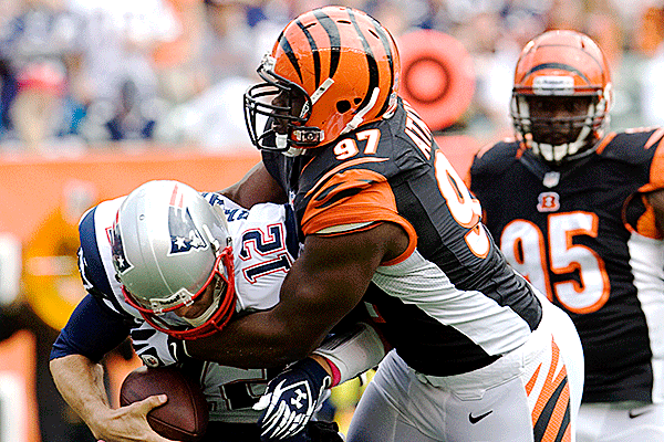
John Facenda once said that Football is a Two and half hour carnival of color sound and action noting that the aesthetics of the game are a large part of the experience. As an artist Im drawn to good matchups on the field, not only on a football level but also from an aesthetic level. Colors, shapes movement are all components of art. Bodies meshing at the line of scrimmage, twisting around each other reaching for a pass, defenders enveloping ball carriers, bodies clad in clashing and in some cases complimenting colors compel me to tune in and stay tuned in no matter what the score (kind of sounds erotic doesnt it?) But its all part of the sport we love. So with that said here are some of my favorite uniform match ups please post yours and discuss.
 Here I like the complimenting colors with the Maroon and dark Green without the yellow pants.  This is probably one of my favorite of all time, something about how the orange and yellow play off one another with the green thrown in there. This is also the second time in a row that the Packers have played in Cincinnati where the Bengals have worn their orange jerseys.  The lighting in the Superdome really brings out the opposing teams colors when they wear their dark colors. Here I like how the Aqua is reflected.  The Red, White and Blue with some gold, classic.  Another classic uniform match-up. This current uniform set of the Chargers is my favorite in the league, the two shades of blues and the complimenting yellow on a white pallet is modern yet classic. Last edited by Summo; 11-06-2013 at 02:33 PM. |
|
|

|
| Advertisements |
|
|
#2 |
|
Living Legend
Join Date: Mar 2006
Location: PA
Age: 45
Posts: 17,460
|
re: Best Match-ups, aesthetically speaking
Eagles - need to return to Kelly Green...this new shade is hideous.
I think the Titans have one of the ugliest designs ever. Ironic since the old Oilers were one of my favorites. Bengals are a mess too. My favorite matchups:  
__________________
Not sent from a Droid, iPhone, Blackberry or toaster |
|
|

|
|
|
#3 |
|
Warpath Hall of Fame
Join Date: Mar 2005
Location: UNITED STATES
Age: 38
Posts: 36,131
|
re: Best Match-ups, aesthetically speaking
I love the bengals look and the Oilers was classic
__________________
Mediocre people dont like high achievers, and high achievers dont like mediocre people. ― Nick Saban |
|
|

|
|
|
#4 |
|
Living Legend
Join Date: Mar 2006
Location: PA
Age: 45
Posts: 17,460
|
re: Best Match-ups, aesthetically speaking
Bengals helmet is one of the best in the league but below the chinstrap hey're a mess. The stripes don't line up or match, too much random piping and striping.
    It looked better here:   
__________________
Not sent from a Droid, iPhone, Blackberry or toaster |
|
|

|
|
|
#5 |
|
Warpath Hall of Fame
Join Date: Mar 2005
Location: UNITED STATES
Age: 38
Posts: 36,131
|
re: Best Match-ups, aesthetically speaking
good point
__________________
Mediocre people dont like high achievers, and high achievers dont like mediocre people. ― Nick Saban |
|
|

|
|
|
#6 |
|
The Bringer of Digital Bling
Join Date: Apr 2004
Location: Lindenhurst NY
Age: 54
Posts: 892
|
re: Best Match-ups, aesthetically speaking
I always liked the Bengals, Rams and Eagles helmets where they took a more creative route. Instead of slapping a logo on the side of the helmet they actually used an element of their mascot. I don't have a problem with the current Bengals uniforms other than the big white void under the arms of the jerseys, just not necessary. I also like the current Green the Eagles use, it a modern version of the classic look which is cool in my book but trying to match a paint color for use in some pieces of art I have done is impossible.
|
|
|

|
|
|
#7 |
|
Warpath Hall of Fame
Join Date: Mar 2005
Location: UNITED STATES
Age: 38
Posts: 36,131
|
re: Best Match-ups, aesthetically speaking
I think the eagles newer unis and logo is way better than the old school look
__________________
Mediocre people dont like high achievers, and high achievers dont like mediocre people. ― Nick Saban |
|
|

|
|
|
#8 |
|
Living Legend
Join Date: Mar 2006
Location: PA
Age: 45
Posts: 17,460
|
re: Best Match-ups, aesthetically speaking
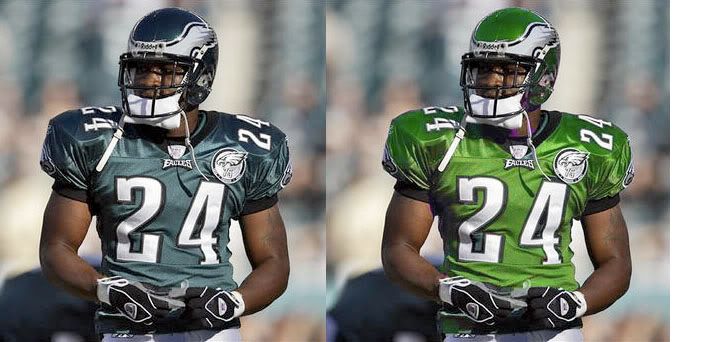
Bet we could agree this would look better:
  Their design and new wings look great but that color is boring.
__________________
Not sent from a Droid, iPhone, Blackberry or toaster |
|
|

|
|
|
#9 | |
|
Living Legend
Join Date: Mar 2006
Location: PA
Age: 45
Posts: 17,460
|
re: Best Match-ups, aesthetically speaking
Quote:
Get some Ford Pacific Green paint...I had a car the exact color of the Eagles helmet once. The color:   
__________________
Not sent from a Droid, iPhone, Blackberry or toaster |
|
|
|

|
|
|
#10 | |
|
Warpath Hall of Fame
Join Date: Mar 2005
Location: UNITED STATES
Age: 38
Posts: 36,131
|
re: Best Match-ups, aesthetically speaking
Quote:
YEAH the bottom one is the best and should be their unis
__________________
Mediocre people dont like high achievers, and high achievers dont like mediocre people. ― Nick Saban |
|
|
|

|
|
|
#11 |
|
The Bringer of Digital Bling
Join Date: Apr 2004
Location: Lindenhurst NY
Age: 54
Posts: 892
|
re: Best Match-ups, aesthetically speaking
Matching it in a Urethane or lacquer would be easy enough since they do it with computers and Home Depot used to sell NFL team color paints, but finding or mixing an acrylic artistic paint is hard, I've come close but not exact (I'm a bit of a perfectionist).
|
|
|

|
|
|
#12 |
|
Living Legend
Join Date: Mar 2006
Location: PA
Age: 45
Posts: 17,460
|
re: Best Match-ups, aesthetically speaking
Hold on...I'm way off topic. I just noticed this is a Math thread.
OK, how can math be aesthetic?  
__________________
Not sent from a Droid, iPhone, Blackberry or toaster |
|
|

|
|
|
#13 |
|
Warpath Hall of Fame
Join Date: Mar 2005
Location: UNITED STATES
Age: 38
Posts: 36,131
|
re: Best Match-ups, aesthetically speaking
nice rack
__________________
Mediocre people dont like high achievers, and high achievers dont like mediocre people. ― Nick Saban |
|
|

|
|
|
#14 |
|
Living Legend
Join Date: Mar 2006
Location: PA
Age: 45
Posts: 17,460
|
re: Best Match-ups, aesthetically speaking
Thanks, I work out.
__________________
Not sent from a Droid, iPhone, Blackberry or toaster |
|
|

|
|
|
#15 |
|
A Dude
Join Date: Feb 2005
Location: Newtown Square, PA
Age: 45
Posts: 12,421
|
re: Best Match-ups, aesthetically speaking
I like this thread and this fringes forum. It adds depth to the overall site. Good stuff.
I still like the black and yellow of the Steelers. And it's cool having one side of the helmet blank and the other side with the logo.
__________________
God made certain people to play football. He was one of them. |
|
|

|
 |
| Thread Tools | |
| Display Modes | |
|
|